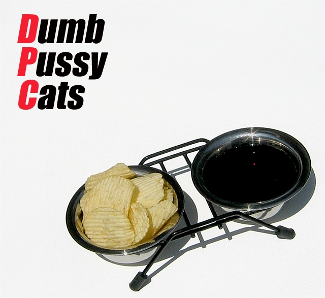
Seems that the food and water dishes are untouched. Perhaps it is a case of dumb pet-owner (is) clueless? lol
As far as the picture is concerned, I really like the sharp shadow and clarity. I'm somewhat put off by the highlights but it seems that the photographer used a small apeture to try and reduce the glare so I have to assume that they were done that way on purpose.
I really like this. The band name is not only believable but somewhat likable. The photo is crisp, amusing, memorable, fits stylisticly with the band name, and functions well compositionally as an album cover. Great work.
Hmmm, if there's a connection to the title and the photo I'm not getting it. The shadows are a bit harsh. Composition is good, I like the use of negative space.
Hum, not sure it's the pussy cats who are so dumb when they aren't the ones filling the bowls! :)
Not a bad shot, the sun reflection on the liquid bow is a nice little touch but I'm not sure if that's supposed to be pop or coffee?
Clean, crisp, nice use of negative space though the lettering is a bit large to me, maybe bring the size of the font down one or two notches. As is an 8





 Add photograph to your favorites
 Add photographer to your favorites


 Photographer found comment helpful.


