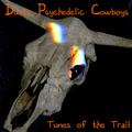
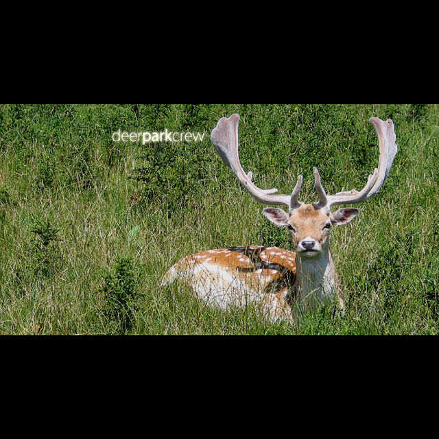
Nice catch. As an album cover I question the use of the black borders containing nothing. It looks as if almost 1/2 of the available space has been wasted. It might have been better to crop off some of the sides of the picture than to try to create a square with blank filler. The choice might have been justified had there been something placed in the blank portions. Unfortunately, the presentation has to fit within the rules and stand on it's own within the challenge.
Nice image - seems unusual for an antlered deer to have fawn markings. Since you elected to add the black bands top and bottom - the text would work better in the top black instead of the image.





 Add photograph to your favorites
 Add photographer to your favorites


