ok, how'd you do this...this kid is obviously too young to take direction. i can't imagine you just happening upon this situation and going 'oh, lucky me; this fits dpc.' i mean, is this a case of abuse, or what? from the look in his eye, this must be, like, what...the 300th shot? don't they have child labor laws where you come from? did the little guy get any cake, or is that how you got the expression?
btw, this is one of my top picks...great shot, and i hope you do well with it.
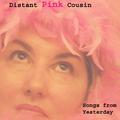
Funny picture. Overall, the graphic editing comes off a bit too amateur. My suggestion would be to go with 1 or maybe 2 colors for your title and drop shadow -- 3 is a bit 1980.
The photo is really good as an album cover. It works. I don't really like the band name but it doesn't sound forced so that isn't really a complaint. I really dislike the text. It has a cheesy appearance.
your font choice fits nicely with your title and pic. the only thing i can think of that would strengthen your shot would be to get rid of the chair in the background.







 Add photograph to your favorites
 Add photographer to your favorites

 Photographer found comment helpful.


