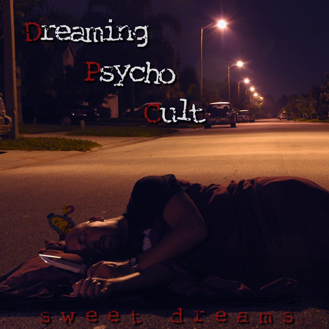
I'm not sure if this is from the monitor I'm using (at a library...), but there seems to be a lack of contrast in this shot, as though it was lightened to show the person. If this is the case, then the exposure isn't long enough imho. If this was taken with the person lying within the light of the street lamp that is directly behind him, I think it would be vastly improved. I'm also confused as to what the object behind his head is and how it contributes to the photo. Overall, I like the idea, but see room for improvement in the execution.
Excellent cover. Too bad there is not a band already named it. You might just have your fist sell!!!! The lighting is great. I especially like the placement of the sleeping man. Brilliant!!
dc
This is a really good shot. The only think I can think of to improve it is maybe having a bit more light on the knife and the guy's face, to make it stand out. 9






 Add photograph to your favorites
 Add photographer to your favorites


 Photographer found comment helpful.


