Very funny...but a very attractive concept, good layout. Would have like a little more clarity in the right male's hand to see the change better, but hey, It is still a creative comp. Bumping you to 7
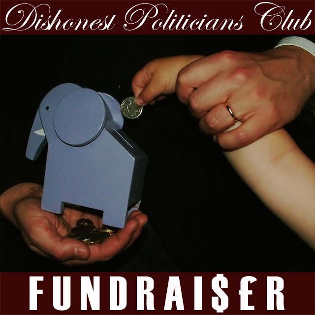
lol..Love it! Very funny, especially the elepahnt piggy bank. I like the lettering and the way you've isolated just the hands/arms and the piggy bank. Definitely looks like an album cover. The only criticism I have is that it appears to have lost too much detail in the skin from too much noise reduction? Good job, nontheless.
Interesting photo, better than most of the fabricated DPC names I have seen here. So many Purple, club, crew so on, not very original for most of them. I gave you the only 9 I could give out, trying to balance the score 50/50 for creativity and originality. Yours was the highest I rated any of them.
Good idea, good execution of the idea and the font and lettering is also well done.
The picture is lacking a real wow or pop factor though. It seems a bit bland. And the smalle hand almost looks like a child's hand, which bothers me for some odd reason, not a lot, but just a little. Not enough to effect your score, but it's there.
Very witty setup. I think the photo is a bit too dark making the text stick out too much. If you wanted to keep the darkness, I think raising the contrast, sharpness, and adding some gritty noise might help the subjects stand apart from the background more.





 Add photograph to your favorites
 Add photographer to your favorites


 Photographer found comment helpful.


