I love this image. I didn't want repetitious items with one thing different. Then I thought about the dinner setting and knew it was the perfect image for me and it turned out exactly as I had it pictured in my mind. Very happy with this and really hope it does well. Fingers crossed that nobody else has thought of the same thing (don't ya just hate that!!!).
YAY the yellow ribbon. I can't believe this. Three ribbons this year, I must be doing something right at last.
Thanks for all the votes and comments.
Statistics
Place: 3 out of 82 Avg (all users): 6.6242 Avg (commenters): 7.3000 Avg (participants): 6.4255 Avg (non-participants): 6.7157 Views since voting: 4802 Views during voting: 340 Votes: 149 Comments: 29 Favorites: 1 (view)
Simple yet elegant in the details. Love it. Could easily be a great stock image.
The one complaint that I have, and if I had voted I think it would have brought me down a point, is that the far left fork is a little bit higher than the one to the right. Kind of hurts the composition IMO.
In any case, you deserve the yellow. Excellent photo.
Creative idea, but some technical things are distracting me: there are a bunch of specular highlights in the glass and you can see a lot of stuff from the studio reflecting in the spoons and the forks, as well as a highlight on your plate. Maybe try to use softer lighting and a reflector (like white foam core or something) to fill in where there are reflections.





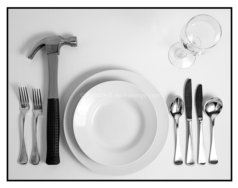
 Dinner is Served
 Add photograph to your favorites
 Add photographer to your favorites

 Photographer found comment helpful.


