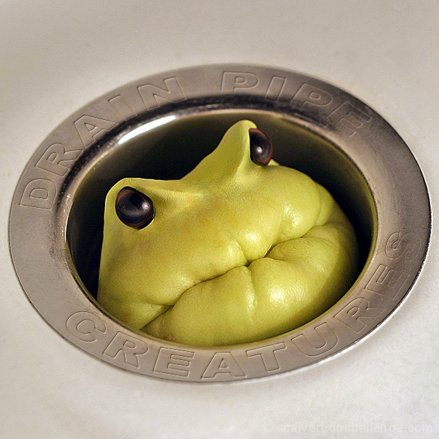
This is basically just a chayote squash inserted into my kitchen sink. I mixed some Play Doh to match the color of the squash and formed ridges for the eyes, which were pulled from an old doll. I held a desk lamp down in the sink with one hand and shot with the other using a 50mm f/1.8 lens.
Post-processing:
Cropped and slightly rotated, levels, heavy USM (I wanted this one to look a little grungy), desaturated most of the sink and metal ring. Cloned out the seams from the Play Doh, and adjusted the color to match better. Dodging and burning around the eyes. Cloned out the existing type on the drain. Created the outlined type in Illustrator, then used a Bevel & Emboss layer effect in Photoshop to make it look engraved. Partially erased and blurred the type to match lighting and DOF, then Levels again to improve contrast.
I expect some people to complain about the legibility of the type, but I think it helps the realism to have some obscurity. If nothing else, I expect a lot of comments! ;-)
Statistics
Place: 2 out of 122 Avg (all users): 7.1330 Avg (commenters): 8.3226 Avg (participants): 7.1889 Avg (non-participants): 7.0938 Views since voting: 14367 Views during voting: 476 Votes: 218 Comments: 71 Favorites: 54 (view)
I remember this one from when I first joined DPC. I just love how that little guy looks, and how he's poking his head up through the drain like that. Super creative, and perfectly executed, as always.
I have to veiw this picture everyday because my 2 year old daughter REALLY LOVES IT.. I like it but she has gone digital over it and always insists that I stop what I am doing and let her see your picture.. so I guess I should say a big THANK YOU for making my little girl so happy.. There is a picture of her on my profile, she looks so sweet but she is really a boy in a girls body... she likes cars, cameras, breaking things, and is VERY loud... anyway... congrats on the ribbon well deserved
Even more impressive after reading the description! I assumed this was some sort of toy -- it's all the better knowing that you concocted this guy yourself!
Woohoo! This is fun! Thanks to all those who voted and commented. Glad you enjoyed it! I'm scoring well with every other entry these days, so I'm really looking forward to Miniature. ;-)
Every time I looked at the entries I saw the cover by kiwiness right on the first row of my screen, and I just knew that one was destined for the blue. There are probably only a handful of members even CAPABLE of taking a shot like that!
Shut UP!!! I thought that was just a pet frog species I wasn't familiar with. This was one of my favorites... I gave it a 10. Congratulations, and I just loved reading how you did it. :)
I don't know what that is, but I love the creativity. The subtle text around the drain works very well, but might be a bit too subtle. The only technical issue I have is a little softness at the bottom right and top left of the drain (maybe a smaller aperture to bring them in closer focus), but other than that, this is a nice shot.
Well, this one just stopped me in my tracks. Finally, a cover that's completely buyable as a real band name and a professional graphic layout. Easily a 10. Great job.
This is not only cute but nicely done though lighting on the metallic rim thing could be more even. Very cute and somewhat bizaare. Just what I like! 9








 Drain Pipe Creatures
 Add photograph to your favorites
 Add photographer to your favorites


 Photographer found comment helpful.


