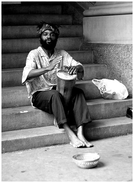
I like the shot but I find the washed out whites bit distracting. Also, I would put more emphasis on the 'basket'. One suggestion from me would be to go lower and go wide.
Interesting shot. Like the choice of black and white. The piece of shiny black shoe on the right and the plastic bag really take away from the feel of the photo. A different angle shot probably could have got rid of them. But even with that I really like the photo.
i imagine you're getting abused becuase it's not square - and there is no text.
but the challenge was to take a photo for the cover - not design the cover.
nice candid - good luck - it's a bit dark at the top






 Add photograph to your favorites
 Add photographer to your favorites

 Photographer found comment helpful.


