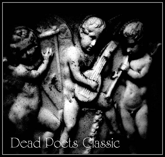
Simple and effective. From the resolution of the uploaded version, I can't tell exactly what's going on with the lettering, could be a little pixelated. Anyway, the whole is quite satisfying.
Nice use of black and white. I'd prefer the font if it was smoother. It would make for a nice contrast against the grain and texture of the statues. Well done.






 Add photograph to your favorites
 Add photographer to your favorites


 Photographer found comment helpful.
