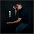
It was my determination to do a portrait of some type for each free study and learn more about studio lighting. So, unfortunately for all of you, I decided to start with a self portrait.
Clarity and vibrance in Lightroom
sharpen and dodge the b/g and my eyes, masked the chair and gave it some topaz to bring out some of the detail
Statistics
Place: 181 out of 307 Avg (all users): 5.5180 Avg (commenters): 6.7500 Avg (participants): 5.5670 Avg (non-participants): 5.4048 Views since voting: 817 Views during voting: 220 Votes: 139 Comments: 11 Favorites: 0
In your self portrait series, you have a great ability to show and capture your emotion. That is often hard for a guy and I am envious of that. Here the lighting is nice and dramatic with lots of shadows and it appears to be your signature style. The placement of the hand, the eyes and mouth slightly dropping show a certain vulnerability. Nice job!
This is a nice self portrait. I like the composition and the execution and lighting.
Not sure what else to say about it really. I do think that if it was cropped by the bottom of the sleeve on your right hand and a little outside your arms it would have worked better for me.
It certainly pops well which is nice.
I'm not sure if I have any helpful critique/suggestions/anything else. Though your right hand does look a little blue to me...
Hello and greetings from the Critique Club-
Since I did vote on your image, I’ll give you my vote and my thinking behind it.
I gave you a 6, personally, and if I were to give a summation of my vote, it would be that this is a competently done portrait, but lacks the oomph to push it beyond that.
You’ve got numerous things going well for you in this shot- the lighting is moody, and matches the expression well. The posing does not seem altogether awkward, but also is not terribly natural, either. I hate posing, both myself and other people, so I feel for you here, and can’t suggest much because I think I’m terrible at it. What I do like about the pose is that you’ve kept the joints bent, and because they aren’t uniform in any fashion, you keep a bit of dynamism present. The lighting itself is soft, and interesting, providing a nice texture to the shot through the shadows. One thing I would prefer is to have a bit more light on your right eye. It is slightly illuminated, but maybe a bit more would benefit things. If you turned/tilted your head ever so slightly you would illuminate more under your brow, while still keeping most of your cheek structure obscured. I assume you shot this yourself though, so it’s always hard to do such things.
One thing that I think detracts from things here, though, is what appears to be heavy dodging on the hand. I’m guessing it was much brighter and distracted the viewer, pull them towards it, and while you have muted its presence effectively, once one sees it, it looks very unnatural.






 Add photograph to your favorites
 Add photographer to your favorites

 Photographer found comment helpful.


