I agree with you... Sometimes it happens that way with art, ya know? You come back later and realize the mistakes; even if the finished product looks incredible, it can still be better.
That's the nature of photography and art in general, don't you think?
I guess that's why no picture will ever satisfy me as being the best; satisfaction is never within reach for the whole of photography, because that will mean the death of future creativity.
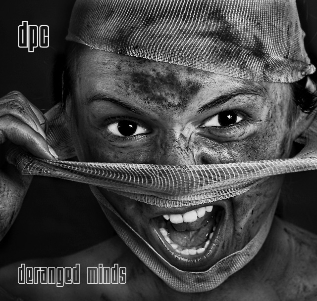
Coming back to look at this photo, I think I went a little bit too overboard on dodging the eyes, I dodged all the detail out of them! Especially the left eye!
This picture is truly awsome. I looked at that picture from 15 feet away and still, the first thing that commes at you is the whitheness of the eyes and theeth and screams madness! Then you have all the amazing gray details of the gauze and balenced by the more crude motifs on the dirty face, Nice... The result is truly remarkable!
Nice to see you back and I see you haven't lost your touch.
I cant say if I saw this image on a C D that it would invite me to buy it but as usual a brilliant shot and I can only stand in awe.
I just seem to be getting worse and I really am trying.
Awsome! I'm happy when my favorite in challenge wins. I had no ideea it can be yours and as I said in my comment during challenge couldn't wait to see who made this. Turns out not only that you do awsome stuff but you also try new ideeas every time, and you are not one of those who stick on a winner "recipee". This makes you my #1 favorite on this site. Congrats for the ribbon!
Heesh....I gotta look at this for a week? It's down right spooky! :-0
TC
Edited to add: You made my wall paper of the day which will probably freak out the ol' lady when she turns on the 'puter in the morning!............. :-O
Thank you all for your comments and nice words. I forgot how much fun this can be :) In photoshop I used calculations on this. I multiplied one blue channel into another blue channel and fine tuned the settings to bring out a deep contrast and full tonal range.
Your model got the expression just right - I can see it being used to advertise the band. I like the font and placement. One of the best this challenge
10 for the photo from me. I love the expression and the grime and the fabric and everything. I think the "Demerging Personality Conflict" is a weak take on the DPC acronym, but I like the text treatment and, as mentioned, the photo stands on its own. my favorite in the challenge!
This is another favorite of mine. Love the photo in b/w. It has very nice tonal range and contrast. The eyes Are a very strong focal point and they show lots of emotion. 10
Outstanding. Joint favourite. The white stands out brilliantly from the grey tones. The subject really grabs you. Great cropping and composition. Minor criticism...not sure title text style quite right
I like the opposing "woman in veil" theme of this photo. The dirt lends an especially striking contrast even though it is something I personally dislike. But because it is so bold and so "not pretty", I will give you a 10.
Excellent shot! Looked at this one a few times, thinking before I commented.
I really like this, the lighting here is brilliant, really shows of the dirty looks, while showing the perfect whites. Her eyes and teeth really stand out, would look good from a distance to grab your attention if it was actually sitting in a record store.
The font you've used is great, the bandage's texture is really brought out. Definately full marks from me!
I really like this photo a lot. The tones are strong, the expression/emotion comes through well. It's interesting and would both attract attention and be memorable. Unfortunately I think your band name is rather unrealistic. It's not really catchy, cool, or easy to remember, so I can't imagine an actual band using it. Of course, I'm more interested in the photo than the name. Great work on the whole. 9
Too good for words. Sensational photo, and then it makes an album cover that I can l really see as being real. Great use of light, contrasts and even the text. The model is excellent, as is the pose, use of props etc etc etc. Just sensational, has to be a ribbon and in a very strong field of competition in this challenge. 10++
This is a top shot for me...I can see this being amongst the ribbons.
Great clarity and vibrancy to the image.. totally fitting with the album title.
Great work....10
This is just wonderful. 10! It's so incredibly striking - there is such a strong connection - the eyes and expression are superb. So too is the mud and cloth. Black and white, high contrast and composition all spot on. Oh and the font and placement of text also works very well. Superb!
A very aggressive photo, the white of the eyes and the teeth adds to the already well done contrasts in the shot. I like the font as well. I think it would be even better with the logo "EX" for explicit lyrics at the lower right = ) I think it would fit based on the cover shot.
A ribbon! Sure this one will get one. Super shot, good expression, super post-production, tasteful graphics. This one looks like a highly pro cd-cover. My favorite yet! 10
Inspiring work!
This is one of the best photographs I’ve seen on DPChallenge.
This is a dramatic composition. The type is simply perfect and it allows the photograph to do the talking. I wouldn’t change a thing about it. If I could give this an eleven, I would. 11







 DPC - Demerging Personality Conflict
 Add photograph to your favorites
 Add photographer to your favorites

 Photographer found comment helpful.


