I almost gave up on this challenge, my roommate is the one who convinced me to keep trying.
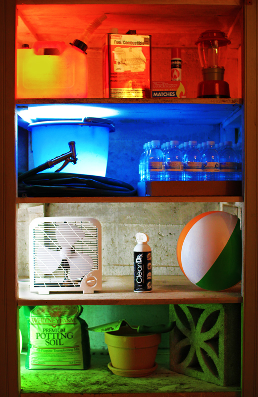
I had the "clever" idea of elements being packaged and produced in modern society.
I was going to try to do something with:
box of matches
bottles of water
can of air
bag of dirt
and the four different types of packaging being the four elements of modern life, but I couldn't really come up with an interesting shot.
I tried just putting them on a white table in front of a black background (and later came up with an awesome title for this shot, "Periodic Table of the Elements") but failed to make it aesthetically interesting.
Then I moved them to the shelves in this picture and took some front-lit shots which, again, came out rather boring. I was going to give up on this challenge entirely, but my roommate encouraged me to go play with it some more, and while I was just dinking around with the lights, I stuck one into the bucket and was really happy with the result. So then I just had to cut into the gas can (they make those things kinda thick) and blow up balloons for the green tint (I really need to get some lighting gels for next time) and I'm fairly happy with the result. Unfortunately I recognized the edge of the baloon on the "earth" shelf only after I started post production (and we already took down the set up). I figured cloning out the balloon would be crossing an editing line, can anyone confirm this?
There are some earlier shots where the "earth" layer is more cluttered, which I kind of like (much like the air layer is intentionally sparse), but for simplicity purposes, I pulled out some of the other items.
Lessons learned:
- When having trouble with an interesting shot, play with the lights
- I need to finish reading Light Science and Magic
- I need to get some light gels so we're not scrambling through the house looking for translucent colored objects
- Dodge and burn is neat, but I read up on how to do a non-destructive version using an overlay layer. I'll definitely try that method next time.
All and all, I'm rather happy with the result... we'll see how it fairs in voting. I imagine that the more talented participants will have pictures of actual fire, so that might be some stiff competition. ;)
==== After the Challenge ====
Wow! Top 10 on my second entry!
It was a rollercoaster all week, and while I was hoping to hold onto the 6.4 I kept creeping past, I'm very happy to get above a 6 on my second try. :)
I'm glad so many people enjoyed the shot, and I agree with some of the comments about the image quality. I'm fairly sure that my problem was having my DOF way too narrow for the shot... I didn't notice it until I pulled the shots onto the computer the next day, when I had already tore down the set up... lesson learned, from now on I should take some test shots up to the computer to make sure the shot looks alright. I think this could have scored a few places higher if the image quality was better.
Statistics
Place: 9 out of 47 Avg (all users): 6.3460 Avg (commenters): 7.8462 Avg (participants): 6.0323 Avg (non-participants): 6.3932 Views since voting: 2265 Views during voting: 593 Votes: 237 Comments: 30 Favorites: 0
Regarding the editing question, you could have turned the arc of the balloon green, and that would have been perfectly OK, no question whatsoever. Personally, I think you could have cloned it out altogether and not gotten close to being in trouble, but I've been wrong before.
Nice take on the challenge: certainly more creative than mine :-) Congrats on top-10.
I like how you set this up. Very diffent from all the other entries. The color emphasis added a lot to the composition. There are actually several small items in this shot, but they do not attract attention to themselves. The image is viewed as a whole, and a very pleasant one it is. bumped to 8
love your concept.. very creative.. would have been cool if the lantern was lit. It is unfortunate that detail is lost in the hose, gas can and water bottles. The image as it is could be improved with some light processing.. maybe to just remove noise, a little sharpening and a shadow/highlight adjustment... Still 8 for creativity.
Great image. Love the different levels and the different colors relating to the items. Well thought out and executed. I'm sure it will do well. Top ten for sure.
A straightforward approach with clarity of concept. The picture lacks something though - perhaps a bit more poetry or a better focus. Between a 9 for idea and a 4 or 5 for photo = 7
I am not sure what everyone else will think or vote, but this is the most original composition in the bunch, I can see it getting slammed, but I give it a 10. Hope people will notice the subtle light changes in the shelves - no matter where u end up, this was great thinking on your part!!
What a heck of a lot of work went into this. Marvelous concept and execution. Thoughtful consideration of objects, and the color appropriate lighting is a wonderful touch.
Such a great take on the challenge! Love the idea of the different color lights for each element!
I wonder whether it would've looked better (or worse?) if you went more minimalist and only had one representative item for each element in each of the compartments?





 Add photograph to your favorites
 Add photographer to your favorites


 Photographer found comment helpful.


