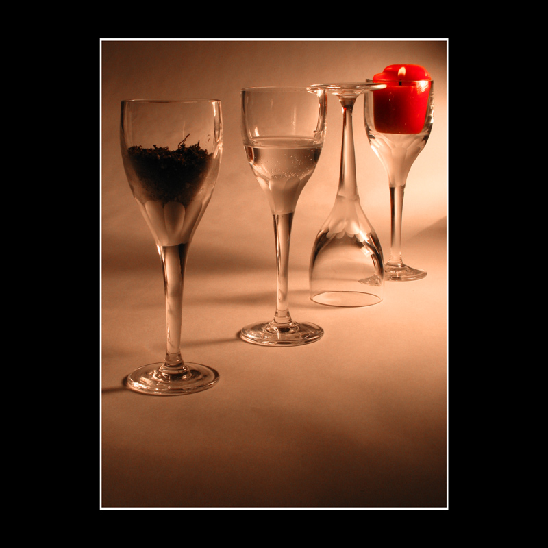
Of all "4 glasses" takes on 4 elements this one is the best. Apart from using perspective rather than face on I absolutely love the depiction of air! :)
I think your border is way too big. The area of the border seems to be almost as large as the photo itself. everything also seems to be out of balance. sorry, I really don't like this.
Not bad. I like the way the background is lit, though it would be nice if the "earth" glass were a little brighter. Still, the highlights are controlled nicely. The angled positioning is a nice touch, but I feel like the spacing is just a tad off--the right three seem more tightly grouped than the left one. Finally, I think that it would be good if the red candle popped a little more--the rest of the image is very close to monochrome, so the one use of color should make more of a splash.
Slightly different from two other images using this approach. This has the most dynamic layout, and the inverted glass is a clever choice (to trap the air :-)
I also like the edgeless bg, and the terrific, oblique lighting. But there is something a bit off on the color - the whole image seems a bit dull, lacking some sort of crispness and zing.
I understand what you were trying to do with the 3rd glass containing air...but feel like the reversed orientation of the glass disturbs the flow of the picture. Right side up and this would've had much more impact.





 Add photograph to your favorites
 Add photographer to your favorites


