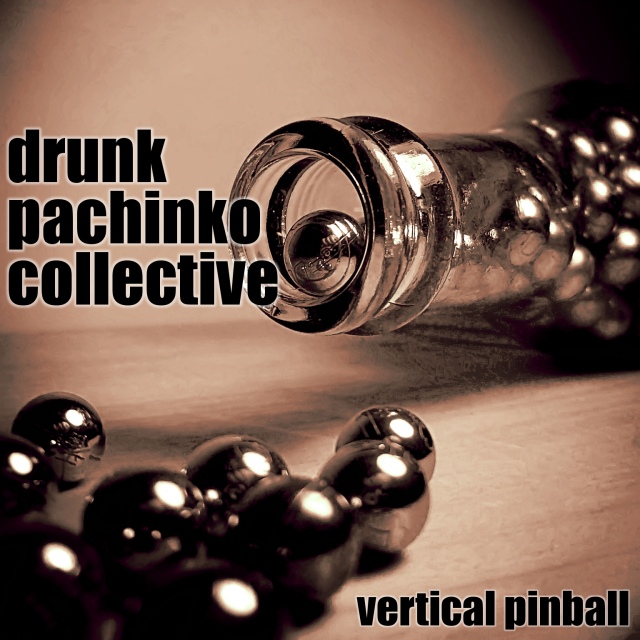
I think this shot is great...I just wish that the lettering wasn't covering up the lip of the bottle. The distortion just under the bottle is also a little distracting.
I like this. Technically it has some problems, like the highlights and the shadow area below the bottle, but it is a good idea with the visual impact needed to help sell an album. Hope you place well.
Awesome! I was going to submit one but not enough time on my part, I would have named it, Derelict Porstituted Conglomerate, and had one of those dancing coke cans that dance when you sing.
Nice to have an album cover which isn`t just a reflection of the groups name but shows a bit of originality by reflecting the name of the album.
Nice work
Excellent creative idea, visually very attractive and love the colours.....but there's an area under the neck of the bottle that appears patchy ?reflection from the glass. Overall though......very striking image.
Hey, I've learned a new word! (Had to google pachinko). Really like the image and the choice of lighting and slightly shallow DOF works well. Text design and position is good. 9






 Add photograph to your favorites
 Add photographer to your favorites


 Photographer found comment helpful.


