I somehow knew that it was going to be tough for this picture to end up high. Nothing to do with the quality. Simply, the subject matter. The edgy comps have an uphill fight in DPC.
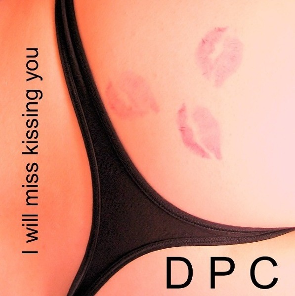
But let us talk about this one. Here you managed the triangle and in a most interesting manner. All the black leave unfinished, giving that grand trine feel. In other words the triangle continues outside the confines of the physical visible area. You did wise with the type selection. It fits the character of the smart composition. I believe you did everything correct. Even the color is good and so are the kisses. The only minor change I would have made was to shift over the song name and space it from the edge the same distance you did with DPC. However to end up at 5.4 with this concept is a good negation to those that love to vote down this image.
Personally I like this shot because it looks convincing and because it has a touch of humor. The composition is tight, the color is great and the general feel is "cool." I feel you did a very nice job and i feel it is complete.
Nice idea, I would have had the lip marks more red and solid. I also would have changed the font to some sort of "script" because it looks a bit static and plain this way :)
Hmmm. Setting this one up would be fun!!!!!!
Who got to do the lipstick job? I like this picture. Not crazy about the band name
something like "Dark Pantie Cult" so that it fits the picture better?
Just an idea. Good job.
Excellent composition - I love the way it's both abstract and yet perfectly recognisable at the same time. Focus seems a touch soft in areas and the lighting is a bit uneven. Text positioning works well. 9






 Add photograph to your favorites
 Add photographer to your favorites

 Photographer found comment helpful.


