|
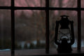
The placement of the subjct in the frame seems a bit off. It's sometimes good not to follow the rules but here doing so detracts from the compositoin leaving a large empty space at the top of the photo. Love the light. It's got character. I also like how you gave the room a dark feel... |







 Add photograph to your favorites
 Add photographer to your favorites


