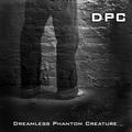
This is a very good image and Idea for a C D album cover and very nicely done
Colours, detail, lighting, focus and title all really well done
I agree with one voter that the wording should not be white but maybe a colour (maybe gold ) taken from the image to tone in nicely
I think D P C voters obviously liked your image because you have a very decent score. It competed well with the others but there were a lot of very impressive entries in this challenge.
So Peter there's not much I can add other than to say enjoy your photography and Good luck in future Challenges
If you have any questions please feel free to pm me
Regards
Sally
I love the colours, composition, really moody shot! :-) Though, I am not familiar with the tipography in the left bottom corner. It's so different from the one above (I like that), and the whites are adding too much Contrast IMHO. I would use a smaller font type for the text in the bottom and align it absolutely to the right, I would also use the beige shades instead of the white. Just an idea. (7)
Very authentic looking. I know because this is excactly the type of CD or record I would pass right by while browsing. Not because it is bad art but because I know what type of musical style the art style typifies. Blah. Not to my taste at all. You've captured that style very well. Good choice of font and nice layout.
Lovely subtle use of shallow DOF. Wonderful viewpoint choice and composition is just excellent. Font choice and text placement also work very well. All in all a very strong image which I think any contemporary African music act would be very proud of. 10






 Add photograph to your favorites
 Add photographer to your favorites


 Photographer found comment helpful.


