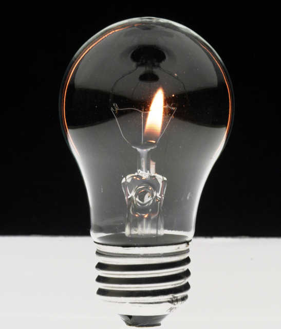
Very clever and generally well done, though it would be nice to have caught the flame centered and obsure the candle just a bit more -- it's peeking out of the right side.
I found the horizontal line at the back a distraction. I loved the thin red/orange trim within the bulb. Excellent theme. The main subject was bright and clear as daylight.
Wowzers! This is a fabulous composition! Brilliant idea, superbly executed. The lighting, exposure, and focus are perfect. I love the two-tone background, it really makes this image stand out for me. The little rim of light visible around the globe of the bulb is cool too.
There are only a couple of small problems: The line between the black and white in the background is not quite horizontal, and it's a little ragged (not crisp enough). Also, the reflection of your ceiling light in the globe of the bulb is a bit distracting, though it took me a minute before I noticed it. And one last critique, there is a little bit of text on the bottom right side of the threads on the bulb, that clutters the otherwise supremely clean composition.
If those tiny problems didn't exist, this would be a 10. But, still, this is my favorite in the challenge! 9.
I've already seen this somewhere...
//www.dpchallenge.com/image.php?IMAGE_ID=79034
Two problems on your one:
*slightly out of focus
*with that amount of light, we can easily see the matche behind. If seeing the matche is intentionnal, perhaps it would have been better placed in front of the bulb.






 Add photograph to your favorites
 Add photographer to your favorites

 Photographer found comment helpful.


