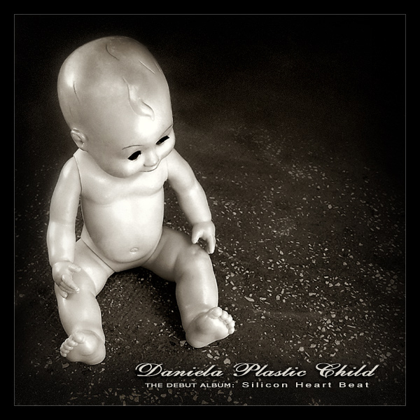
Cristi, I gave this a 10. I thought it was very authentic as cover art. I admit, I thought it was a grigigirl photo because of the dark humour and the gritty b&w quality. You placed well but IMO this was superior work that should have placed much higher than it did.
Great use of B&W - and your composition is just right for this. The text is pleasant and just the right size - so many folks really went overboard with font styles - sizes and "gimmicks."
This is just really cool, I like the floor the doll is sitting on. The different fonts are just perfect. I also like the brown tone the photo has. It would have looked cooler if the doll was beat up or deformed, I know it sounds sick, but thats how some covers look :) (9)
I like the somewhat surreal feel to this image - - - and yet why should a lone doll feel so surreal? Very intriguing. Black and white works very well and composition, including text position, is excellent. 10
This is excellent! I think I can guess who's this is but I won't say until the voting is over. The two different fonts are great! It shows really good graphic design sensibility. The photo is great and manages to be kind of dark without being creepy. Interesting. The name is interesting and original. The title is excellent! Great job toning down the highlights on the plastic.





 Add photograph to your favorites
 Add photographer to your favorites

 Photographer found comment helpful.


