Greetings from the Critique Club :)
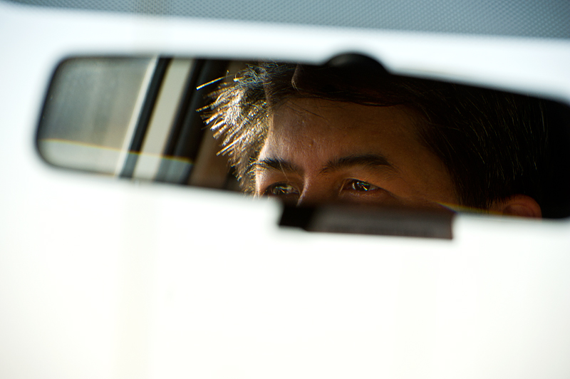
First impression: not very appealing harsh background
By looking at it much longer, I still do not fall in love with your tones. The lighting on the skin and hair looks fine and the colored diffraction pattern in the eyes is a plus. But most of the surface is this imperfect harsh white, with an ugly yellowish vertical streak. The top right blue-grey triangle just destroys the strong contrast, that's certainly no added value.
The mirror gives a nice frame within a frame for the portrait. The eyes are very close to the border, which draws a lot of attention on them and creates a tension in the picture. I guess that is your concept of out of balance. But the mirror itself is placed where you would expect it on a windscreen (they are also always a bit tilted), meaning that the rest of the composition is quite traditional. Therefore I wonder if you did not get some DNMC votes.
Sorry for sounding rather negative. I like a lot some of your photos and the way you think about them.
If you have questions or remarks about this critique, feel free to contact me.
Mike |







 Add photograph to your favorites
 Add photographer to your favorites


 Photographer found comment helpful.
