Author Thread
Post actions
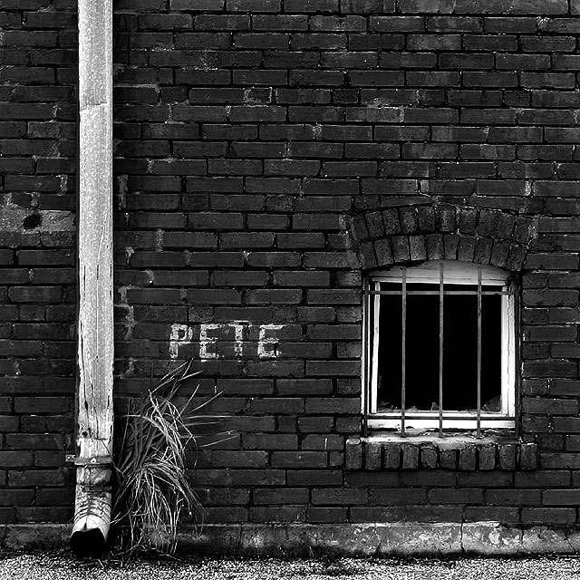
I'd love to see the highlights dodged some more. You could really bring our some serious texture in those bricks. still a fabulous image as is.
Post actions
As JPR - a great shot so well fitted to the challenge and one of the few that would really work on a sleeve.
Post actions
This should have done much better.
Comments Made During the Challenge
Post actions
Beautiful but I wish you had included the whole title as graffiti.
Post actions
I like the urban monochrome shot - looks terrific.
Post actions
i like that you did not have to add text to this one ... nice geometry, too
Post actions
Cool - I like it. The high contrast B&W works well for you.
Post actions
Nice to come across an image with a bit of originality..which actually looks like something you would find in a music store.
Post actions
Very clever -- like the use of black and white for this
Post actions
Great shot.... very simple. like it
Post actions
You've peaked my curiosity, and so job well done. Wonderful composition. Great, dark tones.
Post actions
I particularly like the tonal range of the blacks and whites, as well as the negative space...very well composed image.
Post actions
This is my highest score for images with no text added as the text allows me to see what the photographer had in mind when they designed and shot the image. I just adore the high contrast black and white treatment. I love the detail in the brick, concrete, gravel, pipe, grass, window and paint.... all so intriguing. The composition could not be any stronger. It's wonderful. This will be added to my favourites but I'm voting it only a 9 for this challenge.
Post actions
I love this. My only criticism is you should have taken advantage of the opportunity to use text and titled the album across the top..."Pete Doesn't Live Here Anymore"
Post actions
picture is beautiful, the name so-so.
Post actions
great shot. i could see this on a album.
Post actions
Post actions
Great shot, really effective use of B&W too. 9
Post actions
I love the pattern in the bricks and simplicity of the shot. Nicely understated.





 Add photograph to your favorites
 Add photographer to your favorites

 Photographer found comment helpful.


