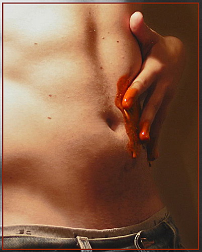
Good idea and crop. Though I feel problems with WB, the chocolate seems to be too brick-red for me and lighting is too harsch. For an erotic effect, use more diffused and mystical lighting, to avoid blow outs and strong shadows. I feel your border a bit rivalising with the main subject, choose a less wild colour for the inside thin line. Keep trying. :-) (3)
In my opinion this is not a very appealing shot. The chocolate does not look dark enough to pull this shot off. Glad to see hat it looks more like art the advertising tho. nice lighting and clarity and composition, just not fussy on the color of the chocolate. it looks to me more like body paint or something along thoise lines. <7>
The premise for this photo is very good...however the color of the chocolate itself, on my monitor, is a bit too red/orange to be truly effective in that regard. It almost appears "bloodlike" rather than as chocolate. This, of course, could be my monitor. The placement of the hand is a bit awkward...perhaps, instead of his own hand, a feminine hand, or his and hers? Possibilities abound. Lighting is good, just a tad harsh on the left edge. The lines and composition are nice...I think a lot of photographers forget how sensual the curves and lines of the male physique can be, as most are more interested in females. Thanks for this reminder to us all. Great effort. :o)
Nice composition. I like the low lighting but it's giving too much of a colour cast. That chocolate unfortunately looks more like fake blood and without the context of the challenge I'd assum it was meant to show an injury. Darker brown might be better, I don't know...






 Add photograph to your favorites
 Add photographer to your favorites


 Photographer found comment helpful.


