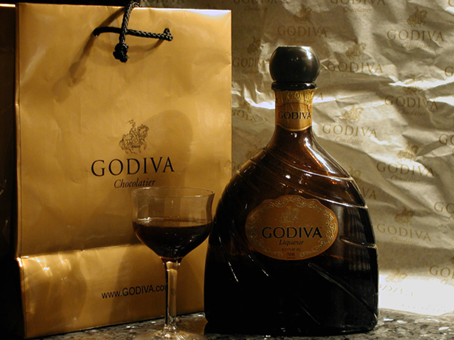
Like to see a little more diffuse light coming in from the left to help illuminate the label and glass some more. It might get rid of some of the shadow cast by the bottle too
Looks a bit like an advertisement for this drink but I think it needs some improvement in setup and technically for you to be able to sell this image to the company. Think 1/2 or 1 stop longer exposure would have given a better expression and then you can add more contrast, probably you need a better lightning. Also the WB should without a doubt be much warmer. The image needs tighter croping from above and from left. About the setup; the bag and the background paper have obviously been under to much usage to give good expression and are rather distracting.
But good experiment.
you've arranged the items well, I like the bit of space empty to the right, would like the background a bit blurred (the lighting here is great), a bit more space under the glass and A crisper bag (perhaps the other side of the bag w/o the fold?). a touch more light on the bottle to bring out details (but keep that partial shadow as it adds interest) Good luck with your shot!
To much "godiva". I would have cropped out more of the right side removing most that hotspot from your picture or maybe even cropping the right side centering the glass. <6> with the crop suggestions in my opinion would have been at least an <8>
Elegant... I hope the rest of the voters see that it is chocolate liqueur. I see there is more than the glas missing :) You would have do well if you shapened the image some more. I love the concept though. (7)






 Add photograph to your favorites
 Add photographer to your favorites


 Photographer found comment helpful.


