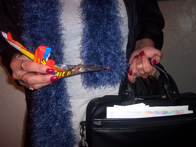
You have a photo that completely fits the topic since it has chocolate, had nice composition and focus, and get's a 3.4 average. No one should rate this any less than a 4.
Anyway, I think this picture deserves much, much higher.
The flash is too bright on the paper and then falls off on the ends. Leaves ugly shadows behind also. Seems a touch OOF where I expect it to be on the left side.
I'd like a bit more light on the whole image or a "spot light" to highlight one element (between the blue boa, b'case with letters, chocolate, hands there's a bit too much fighting for attention)
I like the idea of this shot. However, I feel that the photo should have been based around the chocolate a bit more. Also, it seems as though the flash has been used, and I'm a big fan of natural lighting.






 Add photograph to your favorites
 Add photographer to your favorites

 Photographer found comment helpful.


