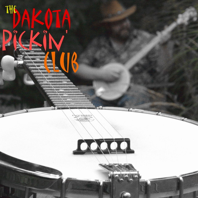
The desaturated foreground with just a hint of color showing in the background was an excellent choice here. The effect works great. In fact, the sharp close up foreground with the blurred player in the background works well too. I'm not sure the text matches the tone of the shot though.
Really love the clarity and sharpness of the banjo set off against the blurred background. The colored font also breaks up the black and white of the image. The strong diagnal lines and font style really give the impression of some high energy picking. Only detraction is the blue left over in the background from incomplete desaturation? Wonder if the photographer is from SLC. Great job.
I really like the photograph, although personally I would have chosen a different font / color than what you have. It doesn't blend with the photo. I would have used a white typeface - the font I don't mind. Although this is a very subjective area and others may think it fantastic! Just my 2c worth :P
Best and most believable band name I've seen yet, with a good picture to match. I love the focus, but I wish the background were a bit softer (as opposed to grainy). I also think you may consider no color at all in the picture, as the jeans/hat are a bit distracting.
Nice shot. The guy in the background works well. I would have used a thin black line around the text to make it stand out a bit more from the photo though. Also, a bit of contrast added (or dodge/burn) would make the B&W work better.







 Add photograph to your favorites
 Add photographer to your favorites


 Photographer found comment helpful.


