|
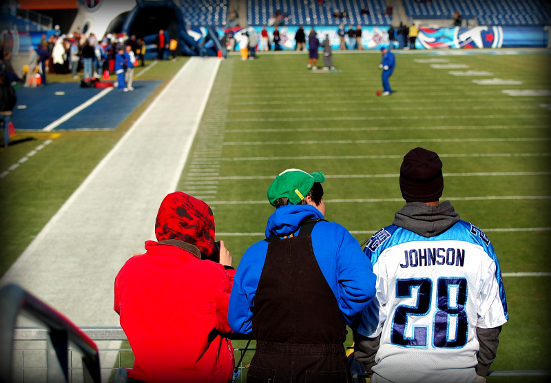
I like the title. The shot surely meets the Challenge Theme. On the minus side, the colors are just a tad too saturated for me, especially the red jacket which is blown out. You may have pulled it back a little with PS Selective Color, but it looks like data was lost. Certainly using Selective Color would have helped, though. The edge burn seems a too much, too. Not being an "expert", these are just observations that are, hopefully, helpful. |







 Add photograph to your favorites
 Add photographer to your favorites


 Photographer found comment helpful.
