Here you have outdone yourself. This is most imaginative and very well composed with expert lighting and what a layout ! My warm congratulations on your 8th placing. You are one to watch !
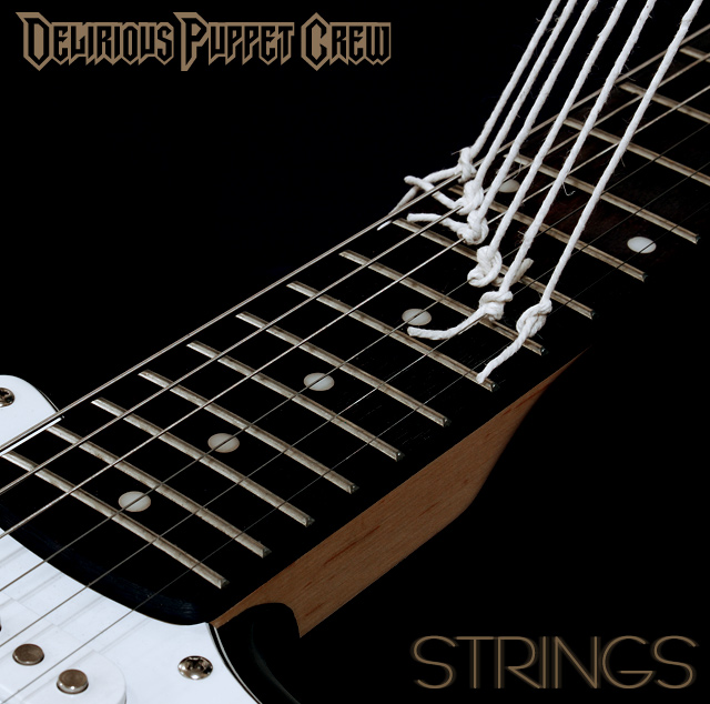
I love the idea here. One of the most creative concepts in the challenge. The shots is crisp and professional looking as well. The band name might be a little bit of a stretch, but a lot of real band names are pretty bizarre, so I could imagine it being real. Great work.
One of my ribbon picks (I like everything about this except the font for the band's title -- clever picture is just icing on the cake) I can see this as an album cover. Well done
Good concept, well executed. The only thing that could be improved,imo, is the shadow on the side. I would have liked to see the color extend all the way to the edge.
A very clever idea - the guitar being held up by "puppet" strings. Not sure about the choice of font but perhaps they are a metal band? Seems a touch too dark overall. 7
Damn I hate you very clever people!!! This is definately one of my favorites. I could not suggest a way to make it better. GREAT GREAT job!!
may be the only 10 that i give.
dc
The picture is great. The idea is great. Buuuuuuut the type style doesn´t match
The type style in the bands name looks like it´s a death metal band.
And the type style in the record name (strings) looks like it´s made by a classical guitarist.
I have to score in down a lot cause of this. sorry







 Add photograph to your favorites
 Add photographer to your favorites

 Photographer found comment helpful.


