Indi, I've got to be honest...I really didn't like this photo at first glance. I came back to it a few times during the week because it stuck with me and each time my score for it got higher. I guess that's the best compliment that I can give -- that the photo really stuck in my head even when I was not on the site. :)
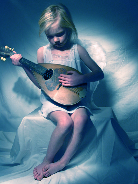
There are a few issues with the picture, most of which have already been covered in comments from yourself and others. Three things really stand out to me, however. First, the wings blend too much into the background -- at first glance they are even somewhat easy to miss. Stronger lighting on the background might have helped that (and also helped avoid the mandolin shadow). Second, the lighting give a greenish tint to her hair, which is unfortunate because I would think you'd want this to be a more angelic white. Third, the cropping of the mandolin is, unfortunately, very distracting and abrupt.
Overall, though, this is a standout entry. The slight blurriness even works with the photo, giving more of a "softer" feel. I wonder how this would look if you did a blur on the whole picture overall? Not a lot -- just enough to give it more of an ethereal effect. Also, I don't mind that the sheet is not ironed. Again, some blurring may help it have a more soft, wispy, cloudy effect. I don't think a stark white background would benefit this photo.
Excellent work, and a very well thought-out idea. Top 10 finish is nothing to sneeze at -- congratulations!!
Thanks so very much for adding your comments on this shot. I feel that it should have placed much higher, but that is the way it goes on DPC. Keep up the excellent work.
Just a few thoughts on my photo: I knew when I entered it that it had some problems, but I just liked the overall feeling of it better than any of my other choices. My first problem was that I only had the model for an hour which didn't leave a lot of time for set up. I did throw the sheets in the dryer for a few minutes but didn't have time for ironing.
This was my first attempt at "painting with light". I set the focus with the light on and then turned it off and used the remote to take the shot. When the shutter opened, I moved a flashlight over her quickly. She did fairly well at holding still for a 6-year-old, but with the six second exposure there was some movement of her arm & hand.
The composition is "off" because the camera was knocked after I turned the light off, and I didn't realize that it had moved so far until I went to set up for the next shot.
The "hot pixels" are actually glitter that she wanted to wear.
Unfortunately, I did this shoot late Sunday and didn't have time to reshoot for the challenge. I do plan on going back and trying again only this time I will iron the sheet, not let her use glitter, and double check the framing before each shot. I like the lighting effect, but I obviously need some practice with it.
The softness of this pictures is very good. You could crop it better. I would like to see the whole instrument. Good picture and good use of light. You will be in the top 5.
Wow! This looks very professional. The lighting is great. Somehow it looks to me as if you shot the photo underwater. The girl looks a bit out of this world with the wings. You fulfilled the challenge perfectly because the whole look of the photo seems to convey blue. Some parts of the photo seem to be a bit out of focus (guess it's motion blur because she moved a bit) but this does not harm the photo. Actually it adds to the "out of this world" (heavenly?) look. Only nitpick is the cropped end of the instrument (a mandolin?) but even with that this photo is one of my favourites this week. -stephan
It's a great pic and I'm absolutely sure, that it'll be one of the first places! It's a pitty that the violin is cut - but I guess you know... 9 - KAOS.
This is just one of the better photos. Nice touch with the hair light. I think what was needed is a backdrop light to seperate the Drop cloth with the Angels wings. The perfect place would have ben right behind the Box she is sitting on.
Even though the blue-green overall tint does nothing in my opinion to enhanse the image, I am selecting it for one of my top ten picks because of content and form. I suggest, when using cloth in a photo it should be ironed.
This is a wonderfully posed shot. The fact that the mandolin's neck is cut off is the only thing I can find I don't like. Its shadow redeems if somewhat, but I would like to see the whole thing. Very good work. Autool
This really is a gorgeous picture, the mood of it is portrayed well and I love the title. Just a few comments, I think that the shadows under the eyes are a bit dark for such a delicate subject. Also the DOF could be a bit deeper, for example the hands are a bit soft. One more thing, a quick iron of the sheet would have been good! Overall, its a wonderful picture and I am sure it will do very well! Good Luck
My favorite picture this week. The colors are soft and innocent like the model. I wish the whole instrument was in the picture and the right hand was more in focus. Otherwise, perfect. Lnede
At first glance, I liked the moody, ethereal feel of this shot. After studying it more, I feel that the blue color cast on the child makes her look ill, and that makes me feel a uncomfortable. For the composition, I think that placing the child more to the right hand side of the frame, with the neck of the instrument, and her legs/feet angling to the left, into the "negative space" of the frame, would have been more effective for me. I still like the overall "feel" of the shot. lhall
Love the lighting, very well done - only small thing is the guitar shadow on the backdrop which spoils it a touch. The wings are very subtly shown but the lighting has made her legs look slightly deformed because of the position and how the shadows fall on the right shin, looks very twisted as a result.
Almost tempted to suggest cropping at about mid-thigh level, as the box/ seat is quite visible too - this could make an excellent square cropped picture ?
The halo effect is very softly done and works well with the blue theme/ colouring. Her right hand seems out of focus or blurred though, and her hair seems to have gone green in the light.
A very good entry - interesting in ways most submissions here just don't achieve.
I love this shot! Too bad about the hot pixels! (doen't effect your score), if anything, this seems a little too set up, but very well executed. 9 Swash
This is a very nice picture... though she looks really cold from the lighting! Brrrr... I definely would suggest moving her over a little, to get in the whole mandolin, and maybe softer lighting because the shadow is distracting. Cute picture though. Good luck with it! -Ridergal
This is a really beautiful image. This reminds me of photos I saw in my camera course that were cross-processed. Subject is very well lighted, and the emotional impact of the picture is strong - I feel sad as well now :) Good luck!
This is my favorite so far. And will probably be after I finish voting. Beautifully done. The lighting is excellent. I love the shadows on her face. Only thing I would change is to be able to see the very tip end of the instrument. Still, a 10 from me.







 Add photograph to your favorites
 Add photographer to your favorites


 Photographer found comment helpful.


