Thanks everyone.
Didn't expect 11th place, so I am pleased about that! The comments have been really helpful - yet again. Some wonderful suggestions and ideas have been made for possible improvements to the photo - they all help me to see it in a different way, broadening my perspective and my mind. Seeing other's photos and reading the threads also help enormously, but particularly seeing other's photos. There's some really creative photography on the site. Hoping to pick some 'favourites' out soon.
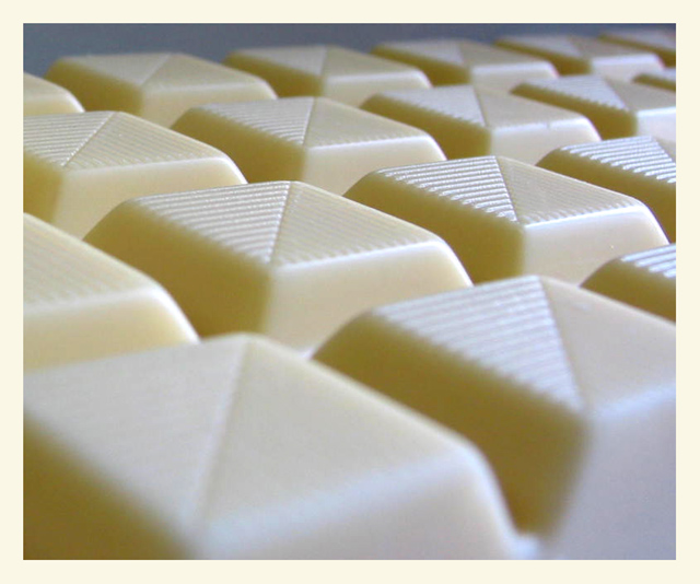
One of my top two. Alot of the shots seem to have the WB off one way or another, but this one is on. Love the DOF and focus that draws your eyes to the middle and then back frther into the pic. A few "hot spots" noted, but maybe diffusing the light just a touch more. Still excellent!!
I would say that this is a very well composed abstract. My favourite abstracts are the ones where the subject appears to be something completely different then what it actually is due to the angle and composition of the image. This looks like a keyboard or something! Well taken. DOF is good, as is exposure - you could have very easily over-exposed the image! 8
Beautiful use of shallow DOF and subtle lighting. Pale blue background works well. Low viewpoint makes this an almost architectural abstract. Nice job!
I like the close-up, choice of angle, and depth of field used. Using milk chocolate has made it stand out too. It certainly has an interesting abstract quality to it given the squares, lines, and textures also. A little noise in the blue background but not overly distracting.






 Add photograph to your favorites
 Add photographer to your favorites


 Photographer found comment helpful.


