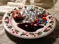
This could have bin a really nice photo if you would have had it bigger and with diffrent backgrounds. Brown and black seems to go together rather than giving the chocolate main attention and the white thing under it is littel bit ugly. Maby yellow and blue instead ??? ( This is just my opinon)
Im going to hazard a guess that most of your comments will read "too small". Something near 640 pixels on one side is essential to getting a shot judged fairly, and from what I can see this shot would have done very well. Good colors, comopsiton, decent if somewhat harsh lighting, But a multitude of sins can be hidden by keeping a shot this small, and you get credit for those sins, since I can't see if they are there or not. Not fair perhaps, but it is reality.
When resizing, make sure you set one side to 640 pixels and then optimize to 150 K for the web. Let me know if you need more instructions for doing this.
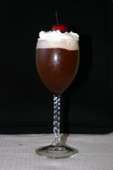
I would like to see this larger using all your alloted 640 size limits. The flash is a bit distracting. I don't know if you could get the flash to reflect in the whip cream to hide the effects but it is a thought.






 Add photograph to your favorites
 Add photographer to your favorites


