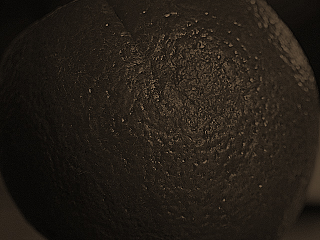
I like the creative idea of a real orange dipped in chocolate. This photo definitely portrays an 'orange peel' effect. However, I feel it would help, with this particular photo, to see more colour contrast - or even greater contrasts in the lights and darks.
Too dark, I see a bit of texture, but nothing that I can identify. Maybe on a white background this would work better. Also has a lot of graininess in the bottom right corner.





 Add photograph to your favorites
 Add photographer to your favorites


