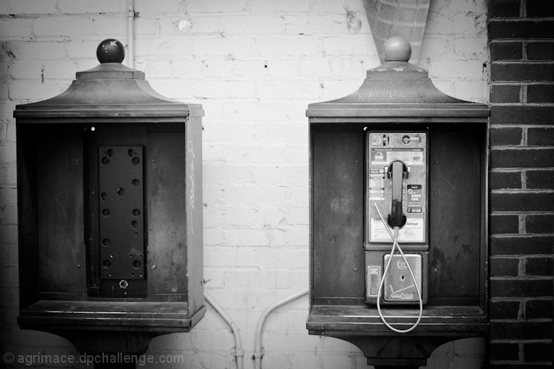
I wonder if cropping the brick out would have made this image more striking. Something about the brick doesn't work for me. I like the symmetry a lot though.
Composition is not quite there i.e. uneven distances left an right and the cropping out the bottoms of the booths. I like the B&W conversion and the vignette, but it does need centralising.





 Add photograph to your favorites
 Add photographer to your favorites


 Photographer found comment helpful.


