Greetings from the Critique Club! ...............................................................
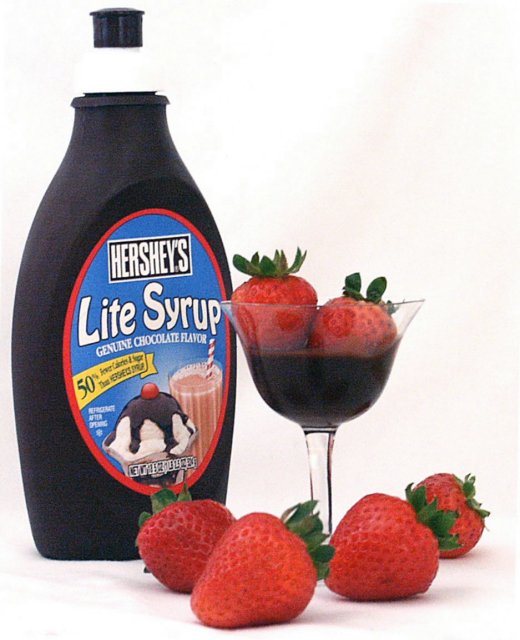
This is what would normally be termed a Pack Shot in the advertising world. As such, the aim is to present the product in an appetising way and to show the brand clearly, etc. I certainly think you chose some lovely fat, juicy strawberries!
Your composition is actually very strong with good depth-of-field from front to back. On the down side however, your lighting is flat which has resulted in noise and a lack of definition in the subject. Strong directional lighting would help prevent this and allow you to pick up more form on the bottle without overexposure. You could experiment with the use of a diffuser (to soften the pinpoint of light source) which reduces highlights and hotspots. If using typical tungsten light then you should adjust the white balance of your camera to compensate for the usual yellow cast this generates.
The image is slightly skewed anti-clockwise, but otherwise this could make people's mouth water.
Nice work! Great color and light. My only complaints are the graininess & overexposure (floating cap on the chocolate bottle) - but these could have been your artistic decision, just not one I would have made. We all know how hard these white background shots are!
This is nicely composed, although you did blow out your highlights a bit as evidenced by the disappearing cap at the top left... probably the place you'd least want something like that.
A little noise on the bottle but really cute idea! I think this will probably be one of many strawberry and chocolate shots I'm about to see..but I like this one.





 Add photograph to your favorites
 Add photographer to your favorites

 Photographer found comment helpful.


