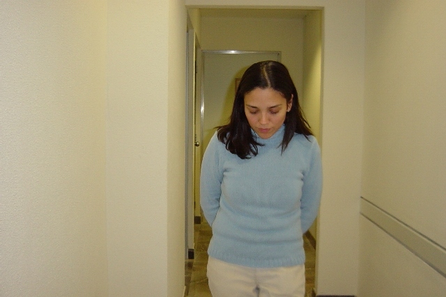
Challenge:Blue (Classic Editing) Camera:Sony DSC-P2 Location: The company I work for Date: Nov 29, 2002 Aperture: F2.8 ISO: 160 Shutter: 1/40 Date Uploaded: Dec 1, 2002
Hello Melissa, don't wonder why you get another critique. Your your photo was assigned to me in context of the Critique Club. So here it goes:
Composition: As Marsha said, the walls dominate the photo. This is somehow a nice idea, because it could be used to convey loneliness to support the "feeling blue" mood of the photo. But unfortunately it doesn't work here. The right wall has this bar which is nice because it could be used as a compositional line pointing to the subject, but unfortunately this bar is missing on the left wall. This looks a very uncomplete and unbalanced. So I also think a vertical crop would be better here.
Also tomzinho made a good suggestion to take the photo a bit further away. I think this would have helped to convey the loneliness and sad mood.
The background is not very interesting. Unfortunately I don't know why you chose this location. Please make sure to write one or two sentences in the "Details" field when submitting the photo. This helps the viewers to understand your photo better.
The photo is a bit tilted clock wise, which to me makes it look a bit unordered/chaotic and thus uneasy. This doesn't fit to the mood of the photo.
Lighting/Colours: It looks like you used a flash. I experienced that this kind of lighting looks not so good most of the times and it's really difficult to use a flash properly. I think a different lighting (or only using the existing lighting) would have improved this photo a lot. The flash makes it look like a snapshot. Especially the glare on the metallic door frame and the shadow of her head on the wall in the background don't look good.
The colour of the sweater is nice but a bit too light. I also think this photo would be a good candidate for the selective colour effect, in this case everything desaturated and the blue sweater being the only colour. See the "How'd They Do That?" tutorial for the photo Rest to see what I mean.
Focus: As far as I can see it, her face is in focus and this is important. Maybe a wider aperture could have helped with a more shallow DOF to blur the background a bit more. But I don't know of your camera supports that or if F/2.8 is the widest you can have.
Art: It's very difficult to convey an emotion in a photo. The blue sweater is nice parallel to the mood you wanted to convey. Good idea! But there are some technical problems which make the photo not very appealing and look like a snapshot. Maybe it is really a snapshot but snapshots don't have to look like snapshots ;-).
I have a modified version of your photo (different crop and selective colour) which I can send you if you want.
The hallway gives a nice depth to the shot, but in my opinion is a boring place to take a photo. The depth is the best thing you have going for you. Lighting ok, focus fine, cropping alright, subject matter fine, composition need work. PTL 5
self portrait???? i like the picture....... wearing blue, or seeing someone in that colour has a calming effect, especially a light blue - even if actual mood of the person is something else. For me, the latter does not apply, as the expression, is appropriate to the image, I can't decide how blue this person is. Tears are blue, blue sweaters calm me. undieyatch
i think the photo would have been more powerfull if you had cropped the sides off, made it black and white, or taken the photo from a position a little further away, maybe in portrait (as opposed to landscape) and given some sense of distance between you and the subject. she looks sad - which i think is what you are trying to capture - but it looks too much like a snapshot.






 Add photograph to your favorites
 Add photographer to your favorites


