|
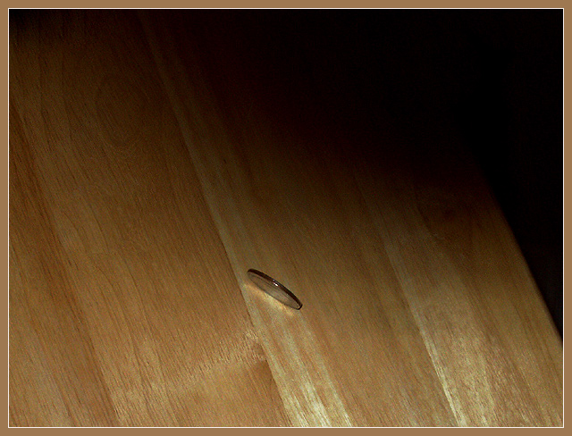
I really like the colouring and lighting. I think they work really well, including the border. The texture of the wood works really well here too. The shadow across the top adds an effective contrast to the wood. The minimalist style of this image is quite appealing. I don't know if the coin is strong enough by itself as a subject to offset the open spaces. I wonder if a lower angle to show more of the coin would make it a stronger contrast. Or a couple of coins lying down next to the one standing on its edge to provide another texture. This image does have a "feel" about it that really works. |






 Add photograph to your favorites
 Add photographer to your favorites


 Photographer found comment helpful.


