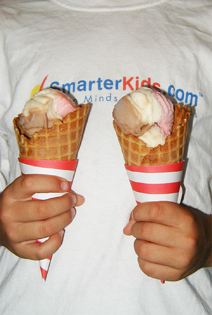
Modeled after an old Dennis the Menace cartoon by Hank Ketchum.
Had to use the flash; tried to lighten the shadows a bit, and use some curves so it would be brightly-lit but not so harsh as flash pictures typically are.
Cloned out a few specular highlights cause by the flash, cropped to 3:2 and resized, one pass with USM at 66%, 0.6 dia, TH=7, JPEG=8/10
Statistics
Place: 136 out of 139 Avg (all users): 4.0625 Avg (commenters): 3.8000 Avg (participants): 4.0588 Avg (non-participants): 4.0659 Views since voting: 1650 Views during voting: 268 Votes: 176 Comments: 8 Favorites: 0
Overall, I think your idea had merit. It was a bit of stretch to fit the challenge, but it did so in a humorous way. Knowing your work GeneralE, it seems like you were a bit rushed putting this together and couldn't put everything into it.
This seems to be another case where marks were taken due to the fact the image appears to be more of a snapshot then purposefully composed photograph. The image lacks that something special that a viewer looks for.
The t-shirt background is one major cause of this problem. The logo on the t-shirt draws attention away from the subject of the picture - the ice cream cones. If you were determined to use a t-shirt background perhaps a flat color would have worked better, as it would provide a uncluttered background where the ice cream cones would have jumped out, providing clear subject-matter.
The lighting used in the photo is quite harsh, and does not light the ice cream cones in a pleasing way. You mention that you used flash to lighten the picture. Flash is a tricky tool to use, especially when lighting an image from directly in front. It gives them a very flat look, and can cast bad shadows directly behind the subject, distracting the viewer. I would have recommended shooting this outside using natural light. Or indoors with some good 3-point lighting. This would have ensured a good, solid form of lighting that gives an interesting 3 dimensional view of the cones.
Personally, I would have done the photo against a black background, with 3 point lighting set up to illuminate the cones and the hands, and nothing else. I would have also liked to see the cones closer together and a much closer crop. This may have given the photo that little thing that makes it special, and please the viewer.
Overall, I think your idea had merit. It was a bit of stretch to fit the challenge, but it did so in a humorous way. Knowing your work GeneralE, it seems like you were a bit rushed putting this together and couldn't put everything into it.
The lighting is done well and the image is really crisp. I feel that perhaps more could have been done with the composition to make the image a liitle more interesting. The writing on the T-shirt distracts my attention from the ice-creams.
Haha, great composition and balance in both subject and framing. I also like the slogan on the kid's T-shirt for the whimsical quality it adds. The only element I found distracting is the lighting. The use of flash really makes for a harsh look and washes out the colors, as well as created unwanted shadows.






 Add photograph to your favorites
 Add photographer to your favorites


 Photographer found comment helpful.


