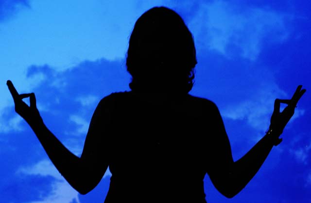
This is a very nice idea for the Balance challenge. Overall, I like the composition. The black and deep blue color scheme is very peaceful. I would have to agree with the some of the comments you received during the voting regarding her watch and the sharpness of the image. Something in me feels that the cropping is a bit stingy. I'd like to see a bit more space above her head and at either side. Also, this pose from what is obviously a standing position doesn't quite portray the meditative quality it would if she were seated. I'm guessing there was no way of achieving this and retaining the simple background of the sky but it appears like more of a set-up this way.
Still, this is a very good effort and shows that some thought was put into the making of it.
I see balance but for the silhouette to work it needed to be very sharp this on could be suffering from the file compression. But a good view of balance anyway.
Great concept and execution. I like this photo for its ability to illustrate balance on different levels...
1) Your subject implies balance
2) Your composition and framing is perfectly balanced
The only thing I found distracting is the reflection from a watch/ bracelet? on your subject. Very insignificant point though, and great shot nonetheless
Nice idea but the watch hurts the balance of left righ,t and the sense of balanced quietude. Outline of figure could be more crisp, but a good idea and a nice graphic solution.






 Add photograph to your favorites
 Add photographer to your favorites

 Photographer found comment helpful.


