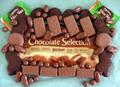
Having a hard time getting the sense of where the focus is to be. It looks the sharpest on the bricks, but I think a bit more DOF would bring it all into view, since there are so many things that are competing for my eyes attention. Diffusing the light off to the left may help get rid of the harshness to it also.
I think a different andgle (taking the shot from higher) would work better. The idea is cool, but there's too much space on the bottom and the subjects are very much OOF (out of focus). Sorry... (2)
Quite the collection! I think this would be improved by cropping out all the blue cloth below the edge fold. Also, the set up could be done more artistically I think. Laying the chocolate bar down flat doesn't help it. I think it might have been improved with a higher up camera angle.
Too much blue in the bottom, the fruits are out of focus, i would prefer a bigger DOF. This will not change my vote but isn't it too much explicit? :-)
tighter crop at the bottom would have helped this quite a bit, I think. focus is a little soft for my taste (or DOF too shallow, hard to tell). You might get nicer definition if you save the JPG with less compression / at higher quality.






 Add photograph to your favorites
 Add photographer to your favorites


 Photographer found comment helpful.


