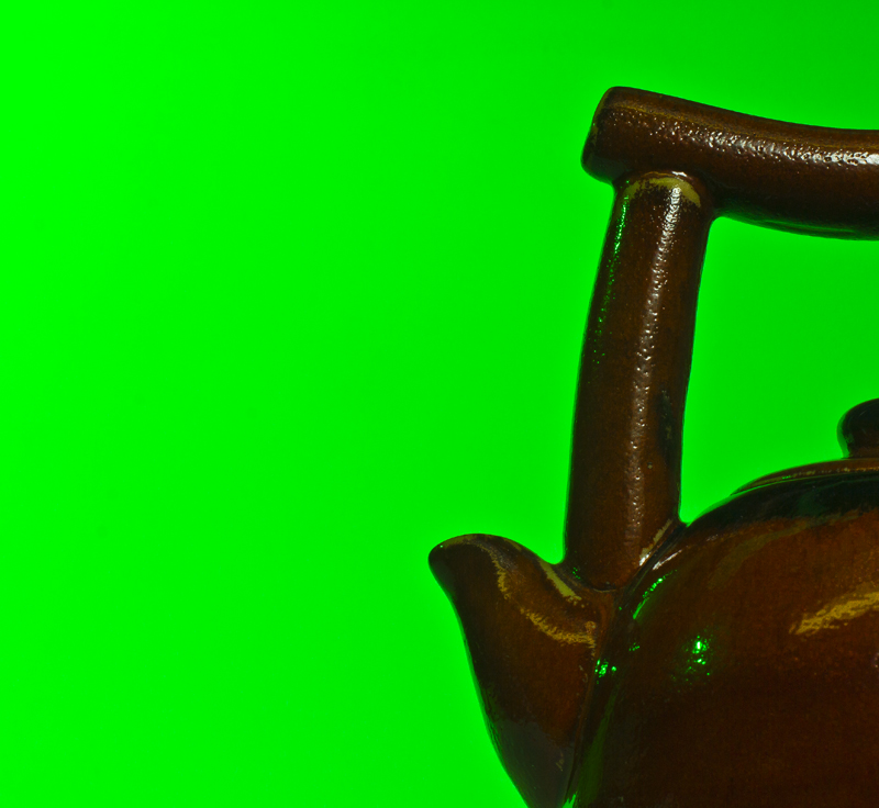
I do like the thought behind this, but the green background is causing a wild color cast on the pot, and making it look not nearly as nice. Being advanced editing, I think you could have gotten a better shot with a white background that you later colored green.
Wow, that's some green. I didn't get it until I read the title.
I wish you had used a duller, darker, more subtle green. When you think of tea, you think of calm, soothing colors, not neon, so the green should have matched better.







 Add photograph to your favorites
 Add photographer to your favorites


 Photographer found comment helpful.


