|
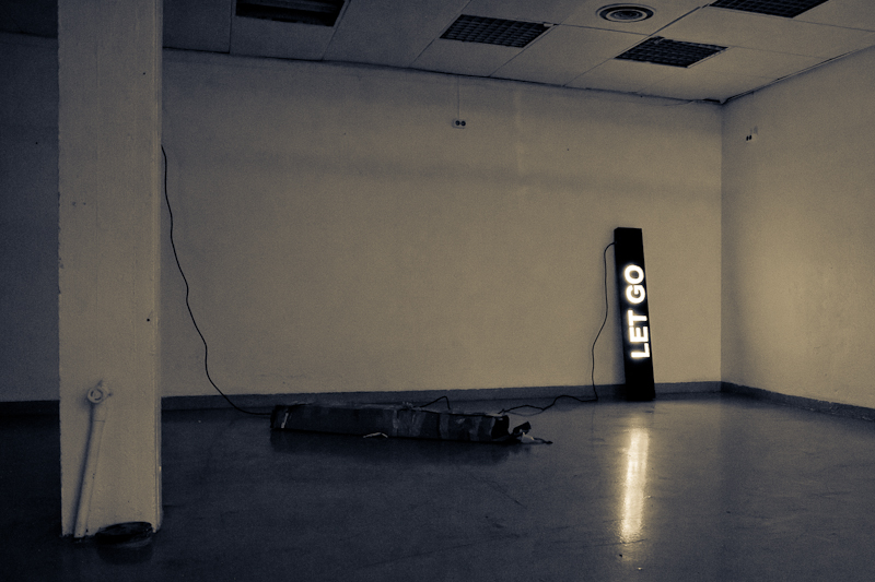
I wanted to come back and look at this to see the details (my curiosity got the best of me). For me, the fact that it's another artist's piece detracts slightly, but not for the most part. To me, I think you have created your own depiction, your own interpretation. I think I like the bw more than color, as well. The red would strike me as too vibrant, lively, for the message. The weight would be lessened in my eye. Good job, and bummer it didn't score higher. |







 Add photograph to your favorites
 Add photographer to your favorites

 Photographer found comment helpful.


