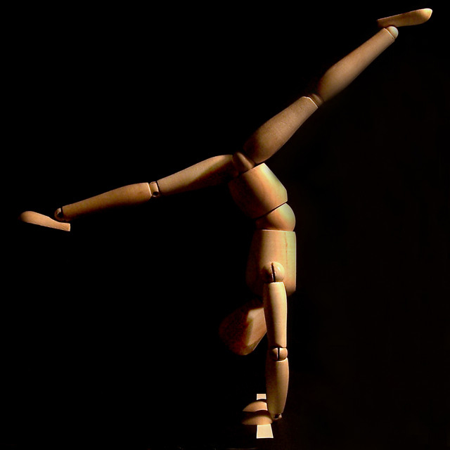
Little wooden man (we call him Woody around the house)...and let me tell those of you who don't have one of these guys - you've got to get one. But it was HECK trying to get him into the various poses I tried, and then to get just the right "balance" to maintain this one. But once I got him into the right position, it worked well. I used black posterboard, a white strip of paper...60 watt incandescent desk lamp. Post included cropping, brightness/contrast adjustment, levels adjustment, curves adjustment, cloned out dust spots and distractions on posterboard, dodge/burn on legs and arms to bring out highlights and tone down bright spots, resize, USM. Special thanks to BP for the great idea! :o)
File: - C:\Documents and Settings\Owner\Desktop\balance\000_0491.JPG
Make - EASTMAN KODAK COMPANY
Model - KODAK DX6490 ZOOM DIGITAL CAMERA
Orientation - Top left
XResolution - 230
YResolution - 230
ResolutionUnit - Inch
YCbCrPositioning - Centered
ExifOffset - 506
ExposureTime - 1/8 seconds
FNumber - 2.80
ExposureProgram - Aperture priority
ExifVersion - 220
DateTimeOriginal - 2004:07:17 21:14:55
DateTimeDigitized - 2004:07:17 21:14:55
ComponentsConfiguration - YCbCr
ShutterSpeedValue - 1/8 seconds
ApertureValue - F 2.83
ExposureBiasValue - 0.00
MaxApertureValue - F 2.83
MeteringMode - Multi-segment
LightSource - Auto
Flash - Not fired, compulsory flash mode
FocalLength - 6.30 mm
FlashPixVersion - 010
ColorSpace - sRGB
ExifImageWidth - 2304
ExifImageHeight - 1536
InteroperabilityOffset - 2404
ExposureIndex - 100
SensingMethod - One-chip color area sensor
FileSource - Other
SceneType - Other
CustomRendered - Normal process
ExposureMode - Auto
WhiteBalance - Auto
DigitalZoomRatio - 0.00 x
FocalLengthIn35mmFilm - 38 mm
SceneCaptureType - Standard
GainControl - None
Contrast - Normal
Saturation - Normal
Sharpness - Normal
SubjectDistanceRange - Unknown
Statistics
Place: 32 out of 139 Avg (all users): 5.9239 Avg (commenters): 6.6000 Avg (participants): 5.8161 Avg (non-participants): 6.0206 Views since voting: 4925 Views during voting: 341 Votes: 184 Comments: 13 Favorites: 3 (view)
I have always been fascinated by the wooden mannequins. I think they provide us with some unique photograph opportunities. Since they are human in form, they seem to easily offer 'life' where there is none. This in itself, can be fascinating :) I believe that Man Ray may have been one of the first photographers to use these as photo props. Some of his photos using these as props may have been done as early as 1926. There is a series called "Mr. and Mrs. Woodman" and another called "La Television" that I'm aware of. These are worth taking a look at if you are interested... search the web and see what you come up with. I have photographed a few of these myself and it is quite entertaining :)
I think your photograph here meets the challenge nicely. Your creative lighting also adds to the image. There are lots of opportunities for creative use of light here. This is one of those situations where you have to try a lot of different options and see what works best. If I was setting this up, I would try lots of different lighting scenarios before I started shooting. I find it interesting to simply observe how light interacts with a subject and how I can change that interaction by moving the light. This particular image would be quite intriguing if the mannequin was back-lit also. Back lighting could possible silhouette the mannequin and create a highlight border around it. The shapes and textures of this mannequin create some excellent shadow/highlight detail.
Another element that I would look at in a little more detail here is 'depth'. You chose to photograph this mannequin from a perspective that is fairly flat. Try some experimentations with different camera angles that create the sense of depth with this subject. With photography, that dimension of depth can be very powerful.
You received one comment here that I agree would be worth examination. Keegbow's comment about the crop... I also feel that some elements of this composition are dangerously close to the edge/corners of the frame. Filling the frame with your subject is usually a good idea, but you have to leave some amount of breathing room as well. The upper right corner is where this is most dominant in your photo.
The key to these figure shots is the lighting. This is pretty good. I think you could've added a little drama by lighting it with a spotlight and having a lighted spot on the floor with the shadow of the figure near the center of it. Not that it NEEDS it, but just a thought.





 Add photograph to your favorites
 Add photographer to your favorites

 Photographer found comment helpful.


