A house of cards is a great subject for illustrating balance. You've got a good start here, in spite of your confusing wording. :-D
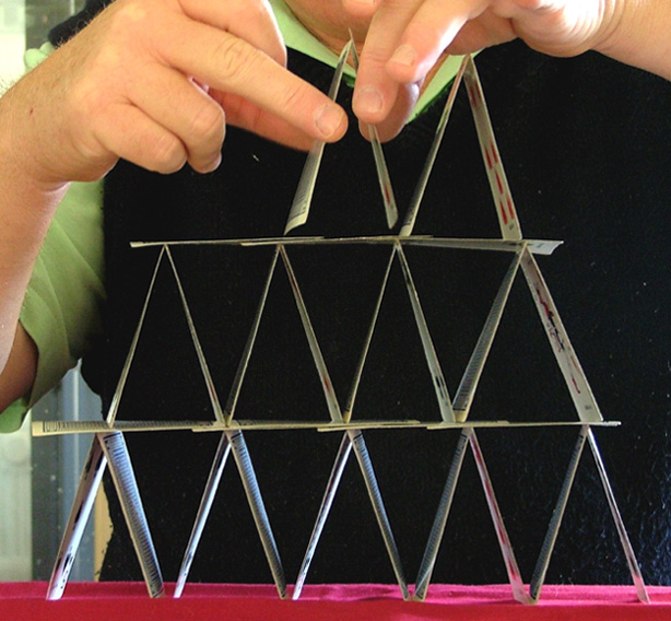
I don't feel that the building of the house is as interesting as the house itself. From this point of view there isn't really much to interest the eye. Someone suggested a more dramatic angle of view and I would have to agree with that. I would go further and suggest that the house should have been created in front of a simple background to really highlight the intricate structure. The black vest is a good start but the bright green shirt and background elements of the room are distracting. The wrinkled red cloth adds another overly bright visual element that detracts from the potential elegance of the photo.
This is the kind of set-up where you could have used a little trickery, such as creating the house of cards with hot glue so that you had a somewhat stable structure that could be moved around a little bit and experimented with. Try different backgrounds using draped cloth, poster board or simply blur the background sufficiently to avoid distracting elements. The angle I would suggest would be from below and from a position which shows the flat planes of some of the cards and not just the edges and negative space.
This is a fun idea that has a lot of potential for dynamic visual interest.
Definitely very representative of the challenge theme. I like your idea and emphasis on the cards. Personally, I would have liked to see the shot taken from more of an angle to give the cards more dimension. But nice shot nonetheless.
I tried to do one of these for my entries and it was way harder than I thought it would be. So consider me impressed! I think taking the photo at a slight angle would have made this more interesting.






 Add photograph to your favorites
 Add photographer to your favorites

 Photographer found comment helpful.


