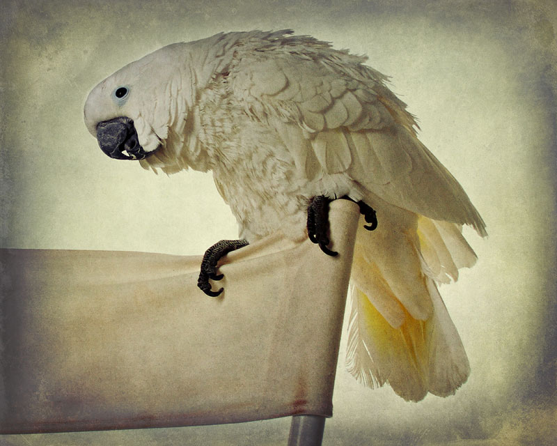
I don't agree with you! I think there are perfect as they are. they break the monochrome feel of the image and add... hummm texture... (clever, right?). IMO they make the bird stand out.
I don't think it's heavy at all! The bird is amazing! Love them, yet a little leary at the same time. One of my son's friends has one of these and it has such a dirty vocabulary it's hysterical.
I think it's fine and the majority of the layering is on the edging, creating a nice vignette. It pulls our eye toward the bird. I am really fond of the monochromatic theme here.




 Add photograph to your favorites
 Add photographer to your favorites


 Photographer found comment helpful.


