I voted first night of challenge and returning for comments.
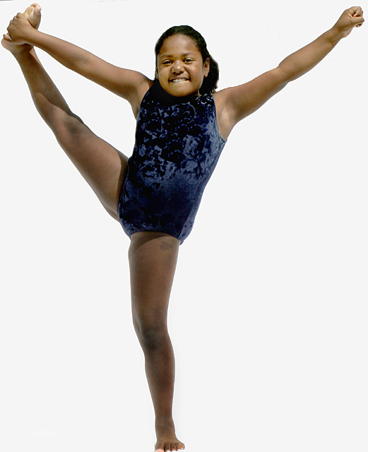
Yes, this meets the challenge head on. It is also a very nice picture. The only thing I would have different is to have allowed just a tad more space on the bottom. You image is being bumped from 5 to 6.
I like your choice of composition and framing here. The way the subject fills the frame is great. One thing I'm not crazy about is the cropped out background. It seems to give it a somewhat "cut & paste" feel. If the original background was distracting to the photo, maybe a really shallow DOF and/or selective levels adjustment to brighten it would have had a positive effect. If you're working in Pshop, then maybe this photo would be a prime candidate for using a radial blur in the background.
Gorgeous shot - my only criticism is with the lighting. Whilst I like the nice clean background, the key light seems to be casting some overly harsh shadows on the subject. Maybe a fill light in front would have lessened the effect and possibly some more diffusion on the key light. But overall I like this image (7)






 Add photograph to your favorites
 Add photographer to your favorites


 Photographer found comment helpful.


