|
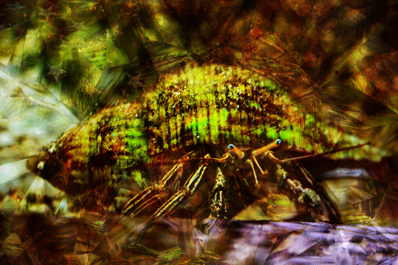
I like what your doing here, it's quite rich in it's content and tones. The purple in the foreground tends to pull my eye away from the central character, I wouldn't be afraid of darkening areas around the crab even more, it kind of emphasizes the abstract designs and deepens the mood using contrasts & makes the viewer search more. I hope that's helpful. There's some really good stuff in there. |




 Add photograph to your favorites
 Add photographer to your favorites

 Photographer found comment helpful.
