First of all Congratulations on your placing with this image
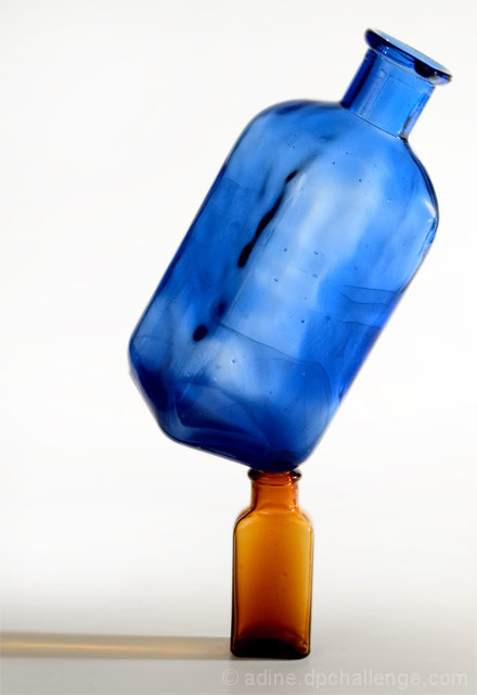
I just love the blue bottle and it is very nicely done but for my own preference I do not like the brown bottle it has little interest maybe a green one would look better but thats just being very picky
The blue bottle almost looks like its been painted onto a canvas and could almost give the same impact without the smaller bottle
I am not very technical but I can see this is good and very nicely done
Maybe the white background is a little stark or harsh Dark blue maybe would look nice
But other than that I dont really feel I can add a lot more Nice idea well taken
Just keep on enjoying your photography and enjoy D P C I find it very addictive!
I hope my comments although very limited help
If you have any questions feel free to P M me
Regards
Sally
I like this one - However the center of balance seems shifted to the right, making it feen actually unbalanced. I wonder if that was deliberate or whether it might be more effective croppec closer on the left and wider on the right. you would lose some of the reflection but I'm not sure that is critical to the image, it serves as a leading line that leads out, off the frame. Usually we want leading lines to lead into the image so the viewer will look at it longer.
Really cool image. Somehow the bottles almost gain "personalities" due to the way you set them up. It reminds me of old cartoons where little guys easily pick up great big bad guys. There's something delightfully quirky about the image. I think a little more white space too the right may have helped just a bit to add a bit more quirkyness.





 Add photograph to your favorites
 Add photographer to your favorites

 Photographer found comment helpful.


