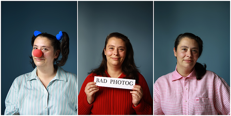
I like the story told, the expressions and all. The one thing that bothers me is that the background. The background color shading is different in each of the frames, breaking the story line. The lighting on the first image also seems a bit harsher than the other two. Still good effort and thought. Focus is good too.
I love the portraits. Nice and crisp and good lighting. I don't like the negative space on all three of them. Wish you were all three moved up in the frame. Or... perhaps the middle you upside down? (not voting)





 Add photograph to your favorites
 Add photographer to your favorites

 Photographer found comment helpful.


