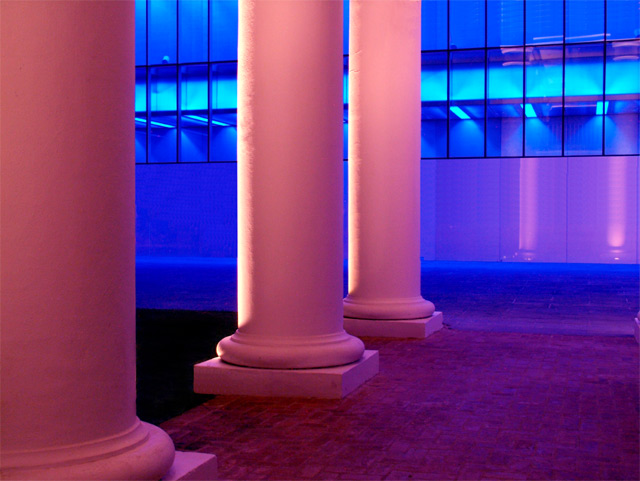
Cloned out some reflections in the blue glass and part of the building that was protruding from the first building. Also cloned out a base light near a column. Despeckle, and adjusted the levels to bring more red out of the lighting. Cloned out some weeds near the base of the columns.
Statistics
Place: 90 out of 139 Avg (all users): 5.0058 Avg (commenters): 5.0000 Avg (participants): 4.9146 Avg (non-participants): 5.0899 Views since voting: 1182 Views during voting: 269 Votes: 171 Comments: 3 Favorites: 0
I really love these warm colours so straight away your image is attractive to me. The tones are lovely
The detail and focus are also very good
I see where you are going with this but the image itself does not say Balance to me and I think when you look at the top 10 you will see how people seem to vote
If it is not obvious to a person on a quick glance people tend to vote mid to low if they don't understand the image
So even though your image is very good and a lot of images are in so many of the challenges that do an average or below vote, its just not obvious that this was Balance without the title I doubt people would see that
It is very hard to know what people will like I get frustrated myself
But keep up the good work you have obvious talent and remember to be true to yourself I hope this helps
Good luck in your future challenges
Regards
Sally
Great idea ond execution for this challenge. The title, subject, colors, and even shapes are obvious contrasts that imply the theme of balance. Nice color saturation and focus too.




 Add photograph to your favorites
 Add photographer to your favorites

 Photographer found comment helpful.


