Firstly congratulations on your placing 15th is very good
I like your image very much although it appears quite small
Idea, focus and detail all great
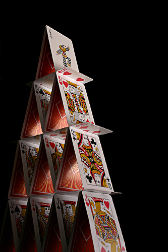
It appears a little dark but then that just adds to the effect IMHO
The only thing that I can think of (if I get real picky) is that you have chopped a little off the bottom cards and that is a little irritating
Also there are some great images in this challenge
So Marc what else can I say but to say keep up the great work you certainly have the talent and the abilty
Sorry if this doesn't seem much of a critique but as I said before
Its a great image
Regards
Sally
This is great. Love the lighting. I'm sure I would have sneezed just before I took the shot :) Must have taken awhile to get the shot. A little compression residue around the edges of the cards.
This was an idea that I'm sure alot of people thought of, and when they saw this shot they either regretted using the idea or were glad they used another. Strong lighting, I like the level of detail in the setup with the different face cards on different levels, the framing was well done with the bottom being squeezed but a bit of room at the top. The use of a triangular void in the upper right used to balance out the triangular figure is a nice touch. I usually like to point out one flaw when giving praise, but I can find none.
Cool picture. I like the way you made the lighting and made the background dark, but that's just my opinnion. You even made each row with the same cards! Did it take you longer to get the cards to stand than take the picture?
I like the lighting here, though some may say too dark. Maybe just a fraction too much to the left and a little too far down with the composition but that's just my opinion. Great perspective and appears sharp - well done (7)






 Add photograph to your favorites
 Add photographer to your favorites

 Photographer found comment helpful.


