Yes... the lemon is dark. Yes... there are reflections on the glass. No... The glass isn't dirty... Yes... you should try this sometime :) It ain't easy...
Statistics
Place: 2 out of 243 Avg (all users): 7.5000 Avg (commenters): 8.5410 Avg (participants): 7.4875 Avg (non-participants): 7.5185 Views since voting: 12873 Votes: 268 Comments: 88 Favorites: 68 (view)
This dpc icon has a staying power that is remarkable. My first impression of it during the vote (I gave it a 5) was that it was set up using a format from a Popular Photography magazine "how to" project circa 1965. I still have that impression of it when I look at it and (to it's credit) the many spin-offs it has fostered on this site. What I like in this image aside from the quality of technique is the 60's pop-op genre it seems to fit into. The colour of it - I always thought was over done, looked at in b&w or sepia, the soul of this composition shines.
Excellent concept and a an outstanding execution. We compose by following creative impulses and the end result contains natural symbolism. Often times the artist does not pre-think these forms. They just happen out of the mix.
Here we have a study in opposites with a cross, the circle divided in 9, the number of change. And of course the clear divisional balance between light and dark.
These innert qualities lie hidden and instead what we see are the brilliant and well balanced colors. It certainly shines and breaks right to the top on the floor vote. This image is razor sharp and one meering the challenge without the saturation of the color blue. Fantastic and a very cool visual with a silhoette cutting on the left of the image.
A good attempt and certainly a worthwhile composition and strong graphic image. Certainly worth trying again to fix the technical issues.
You might want to underexpose it slightly more to increase the colour saturation, then try 'bringing' it back up in software - should get you crisper colours, perhaps.
You really need to find a way to illuminate the front of the lemon, either by a much brighter rear light or some very directed spot lighting, perhaps a torch carefully played on it might help. Not sure that the stem is properly lined up with the background, should be possible to get a really clean 'split' right down the stem.
The reflections on the glass could do with some more careful control too - it is best to do these in a completely dark room, with any obvious light coloured or reflecting surfaces removed or covered up - you want everything behind the camera to be dark or nonreflective if you can, or mask off the 'stage' with black foam core. This has a lot of potential still to be realised.
Thanks for all the comments... I have prepared a 'how'd they do that' and given it to the admins... It should be posted next time they update that portion of the site :)
Fantastic! My favorite by far this week. I hope for a "how to" as well. I would love to see your setup. I'm sure this will win at some of the other sites for you too. WTG, great shot.
I assume from the "Yes... you should try this sometime :) It ain't easy..." that we can expect a 'How'd they do that?' for this one? I sure hope so! Congrats!!!
By the way, I like mushrooms and peppers on my pizza :)
I knew this shot was yours John. I said in my comment during the challenge I'd seen it done before. You use other people's ideas as well as anyone I know. Congrats on yet another ribbon. Even more, congrats on a terrific shot. - Bob
Looks like a photo you'd see hanging on the wall of a trendy wine bar in the late 80's, I keep expecting Grace Jones to slide into shot.
Now that I'm done insulting it...
What can I say. I wish I took photos like this.
Great shot here. I wish the lemon could have been a little brighter though and it almost seems as if I can see the reflection of something in the top right part of the glass. I really like the symmetry of this and the colors are outstanding. Great job on this one John. 10.
In the upper black portion on the right side of the glass, the glass appears dirty with smudges. Also, the focus at the top where the black meets the white seems a bit off as well. Otherwise a nice shot. Not one we haven't seen before, but still a very nice shot. Definately blue. Good luck in the challenge.
Very nicely done. The lemon adds a great "twist" to the checkerboard technique. Would love to have a little "how to" on how you pulled this off after the challenge. muckpond
Beautiful contrasts. The ONLY comment I can make is that it appears that the top of the glass on the black side looks to be a little smudged. But then, I wouldn't be able to see that if the picture wasn't so perfectly clear. Ok a 10!
Aah, I've seen your other works on PhotoSIG. And they are exceptionally good as this one. It's very hard to find a comment and/or critique for you, and I'm sure you want one. Your concept is well executed, and your idea in this shot is fresh and bold which are essential to hold the viewer's attention. (No doubt, the tutorial on 2 Tone Tonic will appear soon.) What I would like to see more, is maybe some addition of waterdrops running down on the side of the glass and have a few sparkle of bubbles rising from the bottom of the glass (it is a tonic, right?). This shot is a straight still life study. IMO, to enable to viewer to absorb completely into your shot, elements like I mentioned above, would create a deeper impact. Overall 9. (Might come back for that 10.)
One of my top picks for the week! I love the composition here. The only minor nitpick is that the glass looks like it's a teeny bit smudged at the top right. Still a 10, though! - alansfreed
This is just too cool. Clean and technically great as usual. You ARE going to tell us exactly how to do this, right? The lemon slice is a great addition. I'm not sure about the glare on the glass - it makes it look 3D, but the whole geometric/2D effect is kind of cool on its own. Anyway, 10! ~indi
Great execution of an original and artistic idea! Probably would have liked a little more lighting on the piece of lemon, or the overall image brighter, but just a personal preference. I have only started to sharpen pictures, so I don't really know much about it, I'm just wondering if this photo needs some, because overall it seems a little soft.
O'.....you clever photographer. Neat shot, fun shot, good shot. Only wish the lemon wedge was more of a true yellow. Of course I admire your work here and think it's very good. Justine
Nice shot, Mr. Setzler. You've got the eye for what wins here. Very simple and striking. This will win this week. I like the translucency of the lemon slice in relation to the glass.
A few things I might have tried to eliminate include the blurr at the top of the black/white horizon, the blue cast on the meniscus at the left side and the lemon's colour refraction in the stem. These are very hard/impossible to do without the use of spot editing, however. Still, in a photo of contrasts I feel such things detract from the image. Otherwise, very nice. Good work. 9.
Congrats to this shot, it's simply great and highly impressive! I'm waiting for your 'How to' tutorial, because I have no idea, how this effect was achieved! - nds
My 10 of the week! And the infamous question.... How'd you do that!? Th lemon really does it breaking the symetry of the centered glass , not to mention that the "not to yellowish" tint draws attention back to the blue in the glass. PLllllllllllllllleaze let me know how you did this shot!! Kosmikkreeper
possible winner... actually I better not say that because every time I do its seems to jinx the photo... so I'll give you a 1 and say "Awful photo"..... (10, great job!!) marksimms
VERY NICE! Beautiful lighting, and great blue! Love the yellow lemon to add another aspect to the picture. This should do well! Very professional looking! One thing I might suggest next time is to really pay attention when you are cleaning the glass...There are a lot of obvious smudges above the cool blue. Nice job though, best of luck!
very cool composition... and a neat trick... I am however, left wondering if swapping the black and blue would be better for the theme or just overkill... either way it's a good one! ~anachronite
This I like. Really neat concept. The only thing I could suggest to fix it would be the color in the blue section being smoother, and maybe a little darker. I Absolutely love the lemon though, which draws my attention. Unfortunately the lemon isn't blue, and doesn't really make me feel blue. Overall nice picture, though not the best for this challenge.
This is a very interesting shot. However, I think the lemon is distracting to the blue theme. Perhaps a blueberry on the rim of the glass would keep thoughts on "blue".





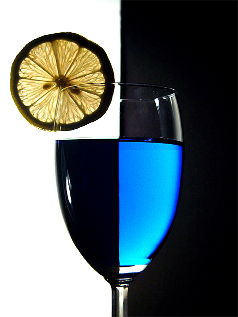
 Two Tone Tonic
 Add photograph to your favorites
 Add photographer to your favorites


